Education Activities To Accompany Chandra Data Analysis Software
Cen X-3 & Clocks in the Sky
Making a light curve
Start DS9, connect to the Virtual Observatory, scroll down the list of Chandra-Ed images, and click on the title:
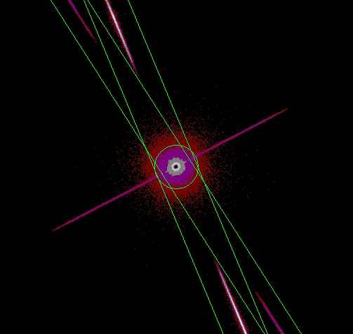
THE WIND AND ACCRETION DISK IN CEN X-3/V779 CEN. Under the "Color" menu , select "he."
You will see an unusual image (see figure at right); a black spot surrounded by bright filled circle of light, along with streaks of light also going off on either side. These streaks occur because this observation uses the Chandra gratings, which act like prisms to break up the x-ray light into their component x-ray "colors," much as a rainbow breaks up sunlight into visible light colors. (The green circle and long skinny rectangles are "regions" used to analyze the data. Do not delete these green regions!)
The central black spot results because (paradoxically enough) Cen X-3 is so bright that the satellite collects more photons (or counts) at these pixels than the detectors can comfortably handle. This phenomenon is called pile-up and, if necessary, the "correct" image can be reconstructed from the original data. But we will not need to do that here.
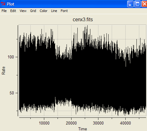
Let's first see how the brightness of Cen X-3 behaves over time; astronomers call this a "light curve.". To look for light variations, you must first select a "region" of the image to study. To learn about selecting regions, click here. For this image of Cen X-3, however, the regions have already been selected (the green circle and the long skinny rectangles). We'll go to the next step. Go to the Analysis drop-down menu, and select FTOOLS/Light Curve. Click OK in the pop-up box that appears. After a short time, the light curve will appear! It will look something like the figure at left.
What is being plotted here? Brightness (in counts/sec) on the vertical axis (except it's labeled "Rate") is plotted versus time (in seconds) on the horizontal axis. The plot looks like a solid mass of black, because the light variation happens so rapidly compared to the length of the observation (nearly 50,000 seconds or14 hours). You can see that the brighntess of the source varies dramatically from just under 25 counts/sec to nearly 150 counts/sec.
How can we determine the period of something varying so rapidly?
|